Indeed
Work @ Indeed
Product Designer
At Indeed I was part of the jobseeker Profile product team. The design organization was newly established, and design was still defining its role within the company. I set the vision for Profile and Resume products for Indeed that defined the product roadmap for the next 2 years. In subsequent years, I focused on increasing user profile acquisition through product experimentation and implementing effective growth strategies.
Beyond my core responsibilities, I led many design community activities and championed Figma adoption when transitioning from Sketch/Abstract/InVision.
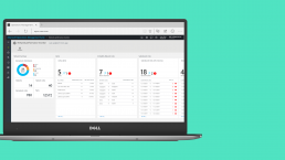
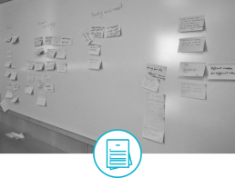
Here is a sneak peek at some of my work.
Get in touch to learn more about my experience building jobseeker experiences at Indeed in detailed case study.
01/ Profile Vision
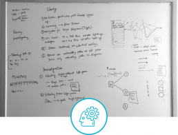
I started in my role at Indeed by creating a vision for the Profile and Resume products. Through a design sprint, multiple iteration, usability studies and a quarter's worth of collaboration, we got the vision that created a product roadmap focusing on different parts of the vision. The vision focussed on creating an Indeed profile for jobseekers that would let them effectively showcase themselves to employers.
On the business side, getting quality resumes and profiles powered the Resume Search business of Indeed as profile itself was free for the jobseekers. Jobseekers got value by being found by employers, making their profiles work for them.
The vision consisted on new features like a more modern profile visual, understanding profile strengths and completeness, suggestions to quickly add missing information, multiple resume support and connecting other Indeed offerings like salary, company reviews etc. The vision work created a product roadmap for the next two years, created focus areas for the product teams, out of which I led the areas of acquisition and growth and contributed to the content and core areas.
02/ Profile Acquisition
After setting the vision, I focused on improving the way jobseekers were creating a profile on Indeed. Through many experiments where I created multi-variant test iterations, my team was able to beat our team’s goal and increase profile acquisition by 130% YoY in the US market and 80% YoY worldwide.
Along with that, I took the initiative to address jobseeker pain points with profile creation, and tied it to the business need of getting more meaningful profiles. I ran workshops to determine the gaps, audits to find where improvement was needed in the flow, got alignment from multiple teams that were connected to the Profile team, and created a simplified profile creation flow. This alone increased not only the number of acquired profiles but also the quality of profiles accreted by jobseekers thus benefitting the Resume Search business.
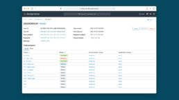
03/ Profile Dashboard
I led design for a dashboard section for user profile that showcased the value of other Indeed offerings like job recommendations, salary data and company reviews within the Profile product. This required partnering with different product teams to bring their content into profile.
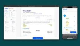
04/ Resume Builder
I designed a growth hack product idea of a standalone resume creator that helped improve SEO for Indeed profile and added another entry point for acquisition.
Oracle Cloud Infrastructure
Work @ Oracle Cloud Infrastructure
Product Design Lead
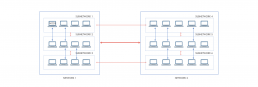
At Oracle I led the design and ownership of DevOps Portal, a platform hosting all of Oracle Cloud's critical developer tooling ranging from Operations, CI/CD, Security and Maintenance. I led the design of many 0-1 products and features that were focused on boosting developer efficiency, hyper scalability of cloud and preventing huge monetary losses.
Apart from this I expanded my scope as a PM and Design Ops manager for my team, for various projects where there was no PM support; along with creating intake, review and design critique processes for my team. I played a key role in the design community at Oracle Cloud by facilitating design org meetups and conducting Figma workshops where I taught new features and best practices to all designers.
Here is a sneak peek at some of my work at Oracle.
Get in touch to learn more about my experience building developer tooling in detailed case studies.
01/ Preventing large scale outages
Caused by developer error
Oracle Cloud, like all hyperscale cloud providers, is vulnerable to downtime incidents. A single global outage can cost $10M–$100M per hour and damage market reputation. Some of these incidents stemmed from developer errors slipping past existing checkpoints, posing massive operational and financial risk.
I successfully launched a new product 'Guardrails' as a core developer-safety service within OCI. By proactively preventing developer errors from reaching production, Guardrails has helped Oracle avoid potential multi-million-dollar losses caused due to outages, safeguarded business continuity, and strengthened developer confidence in the deployment process. The number of large scale events decreased by 51% in FY25.
My role and process
I was tasked with addressing this critical risk by designing a completely new service, named Guardrails, to catch and prevent developer errors before they are deployed to different cloud regions, without disrupting existing developer workflows.
Vision & Strategy
I defined the long-term vision and product strategy for Guardrails, framing it as a foundational safety layer in the developer workflow.
Stakeholder Alignment
I partnered closely with the chief architect, engineering leadership, and multiple product teams to align on goals, build buy-in, and prioritize this initiative amidst competing roadmap pressures.
Product Leadership
Drove the 0→1 design effort while expanding my scope as a product manager, creating the roadmap, defining testing and launch milestones, and sequencing phased rollouts to reduce friction in adoption.
Design Execution
Integrated Guardrails into existing deployment tooling with minimal disruption, ensuring it fits naturally into developers’ existing workflows while adhering to compliance and safety standards.
02/ Automating host patching
and ensuring security compliance
At Oracle Cloud, developers had to spend hours manually patching thousands of hosts to keep our infrastructure secure and compliant. It was repetitive, error-prone work that pulled teams away from building features — yet it was essential to protect the cloud from bad actors. I led the design and launched the Automated Host Patching service across OCI. It now saves an estimated $2M every month in developer time while strengthening Oracle Cloud’s security posture and giving engineers time back to focus on higher-impact work.
My role and process
I led the 0→1 design effort from ground up.
Vision and Strategy
I set the vision for an automated patching service that would quietly handle this recurring task and remove the manual burden from developers. I worked with the engineering leads to build an implementation plan, ensuring we could launch on schedule while staying true to what customers actually needed.
Customer Insight & Scope Alignment
I conducted research with service teams to understand their workflows, and used those insights to persuade the product team to cut overly complex scenarios that weren’t customer priorities and would have delayed us.
Design Execution
I designed the experience end to end, drawing on my deep familiarity with the DevOps portal and developer workflows. I focused on making the solution intuitive, operationally clear, and simple to adopt, while aligning it seamlessly with existing tools.
03/ DOPE design systems
UI Kit, guidelines & templates
While the DOPE design systems used for DevOps Portal was based on an open source design system, it was heavily customized for specific scenarios, used a lot of custom components and was not available on Figma.
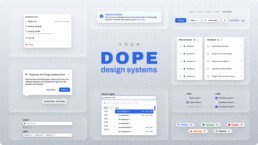
My role
I created the UI Kit for DOPE design systems with my team in Figma, and formulated the guidelines on how to utilize it.
I worked with the developer team to build reusable templates that product teams could use to quickly build their applications for Devops portal with minimal design support, saving both developer and designer time.
Zopper App
Zopper
Company
UX Designer
Role
2014
Year
About
Zopper is a shopping assistant app which enables users to make the right buying decision. It helps you to find the right product, compare its prices on various e-commerce portals and also lets you know its price in near-by stores. With the help of Zopper, you can find the right price and the right place to buy.
Role
As the only designer in the startup, I got to work on Zopper right from the inception to getting it out on Play Store. I was involved in initial research where I visited malls and local shops to understand the buyers and sellers. I worked closely with the leadership and PMs to finalise the feature set and USP of the product. I worked on the app design, end-to-end, from initial wireframes to final designs and assets.

The market
2014 began with the e-commerce business scene flourishing in India. Around 150 e-commerce businesses were competing in this ever-expanding market. There were so many options, that the average consumer was confused in making a buying decision. Further dividing the consumers was the persisting retail industry comprising the brick & mortar stores. E-commerce still was only 7% of the retail market. There was immense value and opportunity in these local. The company’s existing product was Reviews42.com, and it was changing its business model around these consumer pain points.
This is where I started
As the UX Designer, I looked at designing a solution that caters to such market needs. Thankfully for me, being the only designer in the team, I got to be involved in a lot more than just the product. I also got to implement all my understanding of the design process that I learned during my academic projects.
As for any design exercise, my first target was to understand the market, and the users, in this case, consumers. Understanding users and the context is at the core of any design process. Of course, as a technology company, we were more interested in people using smartphones and computers to shop. My other aim was to understand the pulse of the market, consumer buying behavior and the factors that affect it.
The research was done in two ways. First, I circulated an online survey among my friends and friends of friends, asking questions about how they buy, what they buy or, where they buy. The information from these surveys was then collated and inferences were drawn from that. The interesting part was the other research method I adopted. I, along with the product manager, went to local markets and interviewed users of all kind; buyers and sellers. We learned a lot about buying behavior and shopping pattern of people, across different product categories and the factors that affect their decisions.

We were based in Noida, India, and Connaught Place in Delhi was one of the markets I chose to do the ground research.
We got many insights from the exercise, but these were the key takeaways.
• Generally, a consumer was confused about buying from local stores or online. The decision would be based on multiple factors like category, price, location, occupation etc.
• One thing was clear that “Price” was the ultimate factor. Price-sensitive people would not shy away from hunting for deals.
• People use online stores as a tool for product research. They may or may not buy from there.
• For a lot of people, local stores meant trust or approachable. With apprehensions on making transactions online, they would always look for local stores giving them good deals.
One thing was clear, after considering the subject matter, that the product direly needed a makeover. The whole product team huddled up to find out the most suitable name. That’s how we found Zopper. As a designer, I helped the company to look for agencies who could give us great re-brand. Read about that experience here.
Meanwhile, I focused on learning more about android as an app platform because that was the decided direction. Android dictated 91% percent of smartphone market share and it was the obvious choice.
As the next step, I started with creating personas and user flows. From these user flows, I understood the key pain points. I then identified areas where Zopper could intervene and found out new scenarios. I worked with the program manager to look at competes and studied why, how and what they are doing. The key challenge here was building something from the ground up. Not only we had to find features that will make Zopper compete in the market but those USPs that will make Zopper unique.

Creating personas and walking them through user flows, helped me to identify key pain points where Zopper could intervene and help.
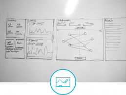
After finding the desirable feature set, I would create wireframes which would be then reviewed by the core team. The core team would consist of all stakeholders, i.e. the co-founders, PM, Dev, and Marketing leads and me, Design. After getting feedback from all stakeholders, I’ll iterate and then the loop will repeat, until the changes were finalized. It is only then I’ll move to the visual design part.

There were several iterations in the wireframe stage, which helped to achieve feature parity and final structure of the app.
Your personal shopping assistant
Zopper was not supposed to be just an app. It would be ‘the’ app to help you make an informed buying decision. It will help you find the right product, at the right price, and from the right place.
App Navigation
The app was structured on four main pivots. Products, Stores, Offers, Categories. The Product pivot lets users dive in into product discovery. The Stores pivot let users discover local stores near them. The Offer pivot provides deals. The Categories pivot dives into the product browsing experience.

For the visual design, my main influence was material design. It had just released in the 2014 Google I/O. During initial product development, and post the first release, there were a lot of experiments with the visual design. I got the chance to understand what resonated the most with users from feedback and user data. For example, in terms of imagery vs iconography vs illustration, which appealed most to users. Information was delivered using cards. Cards of several kinds provided actionable touch points to dive deeper. I also worked with the dev team to automate the process of generating images for deals card based on the deal type and category.

The product page experience was designed to be immersive. In the user journey, it’s the last link in the chain. A user can decide to buy the product and leave the app to go to the e-store or the shop detail page to take further action. Hence, it’s designed in a way that users don’t have to leave the page to find prices for products that offer multiple variants. Users could find prices for all variants, look at specifications, read reviews, or find similar products.

Find the Right Product, asked users a set of questions that would narrow down their product search to suit their specific needs. The questions were laid down on cards. The whole experience is designed to facilitate one-handed use. For example, the price slider can be easily used with one hand and it will show an approximate price as the slider moves.

Within the Categories pivot, each category page let users deep dive into the category and find sub-categories, popular products, new arrivals and fresh price drops. There was also a unique feature designed, called Find the Right Product, which strengthened the idea of shopping assistance.

The Offers pivot showcased deals that were collected from online stores within the Online Offers tab. The Zopper Exclusive tab showcased deals that Zopper gave its users partnering with the local stores near them. Even simpler was to redeem the deal for the user, by just showing the app installed on their phone.

The Stores pivot had information about local stores near user location. Users could find local stores near them based on categories or popularity. Special care was taken to showcase only those stores, which provided rich data so that user experience is not mitigated.

The Products pivot had strategically designed hooks that would let the users discover new products to buy. One of the unique hook designed was Save big every hour which will list product from impulse-buy categories, that had a price drop, refreshed every hour. All hooks had 12–15 cards and a dive deep experience. In fact, all the pivots were designed to provide an engaging experience within them.

I also tried looking at ways in which the product image can provide the accent colour for the UI. The product experience also scaled well for different kinds of categories.

Zopper was designed from the ground up and was released expeditiously thanks to the combined efforts of a great team. We heavily relied on user data and user feedback to improve the app after the launch. It was my first experience of working in a PM-Design-Dev triad and my learning was immense, both in design and the business aspects of it. The start-up environment boosted my confidence in the data-driven design and quick-gratification from user feedback.
This case study was first published on Prototypr.io.
Microsoft Azure - NPM
Microsoft
Company
UX Designer
Role
2016
Year
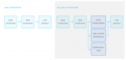
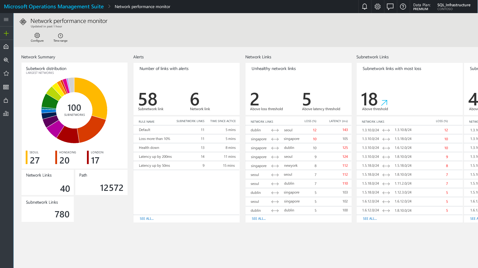
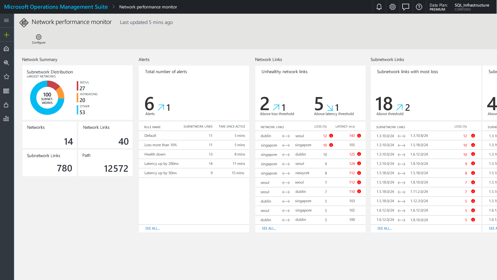
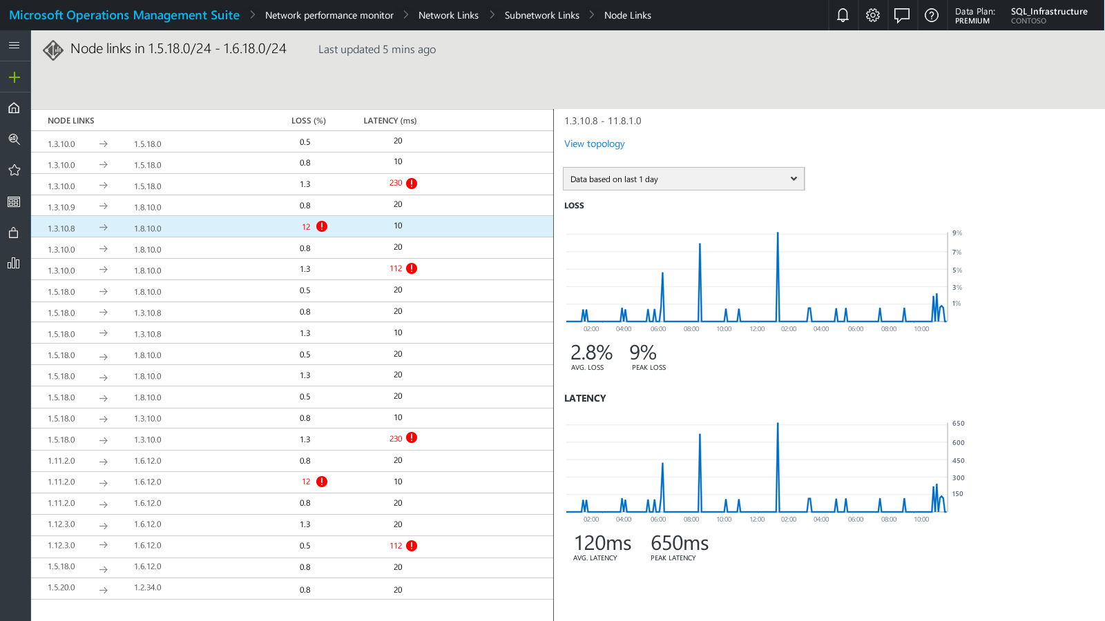
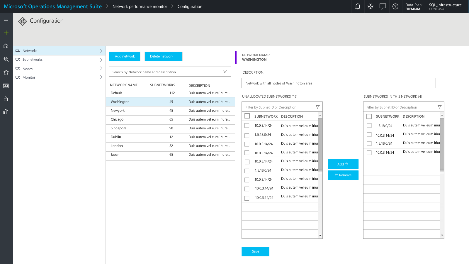
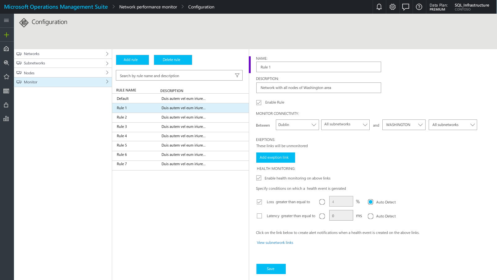
Network Performance Monitor was one of the solutions running on the log analytics platform called OMS (Operations Management Suite). Network Performance Monitor gives network admins real-time monitoring and control of network performance and helps localize network faults. As a designer on the team, my role was to build the solution from the ground up, integrate it with an existing but limited framework and provide a solution that will enable users to monitor, localize faults and configure their networks.
The domain of network monitoring was a challenging experience in terms of being highly technical and an enterprise market space. As my first steps towards building this product, I wanted to learn about and empathize with the user, a network administrator. I partnered with my product manager and interviewed few users from both internal and client sites, to understand the day-to-day work of a network administrator. I also dived deep into the subject of networking and learning how a network functions.
By doing this initial research, I was able to identify the key tasks that the product needed to deliver to its users. These three tasks were:
• Monitoring network health and distribution• Localize faults
• Customize networks logically
As my first steps, I started by brainstorming and whiteboarding sessions, with my product manager to identify all need to have features and good to have features of this product. I also collaborated with my developer team, as they were subject experts and would time and again enlighten me with the existing technology and capabilities of our product. That helped me learn more about the subject and think like the user.
The other challenge was working with an existing but limited framework. The product was part of a larger set of solutions built on top of Microsoft's log analytics platform, Operation Management Suite or OMS. The challenge here was that OMS itself was a fairly new and limited product and the existing OMS framework was only built for log-analytics based solutions, that didn’t support some key components that were required to create the best user experience.
I started with envisioning the product to have an immersive and interactive interface, which would help network admins to have a clear idea of their network and drill down to faults. But the more I started working with the OMS framework and the remote OMS team, I started to understand the limitations. This partnership with the OMS team, helped me to use the framework to its full extent, pulling components from other solutions, but also in pushing the framework and creating new components, that were later adopted by other teams.
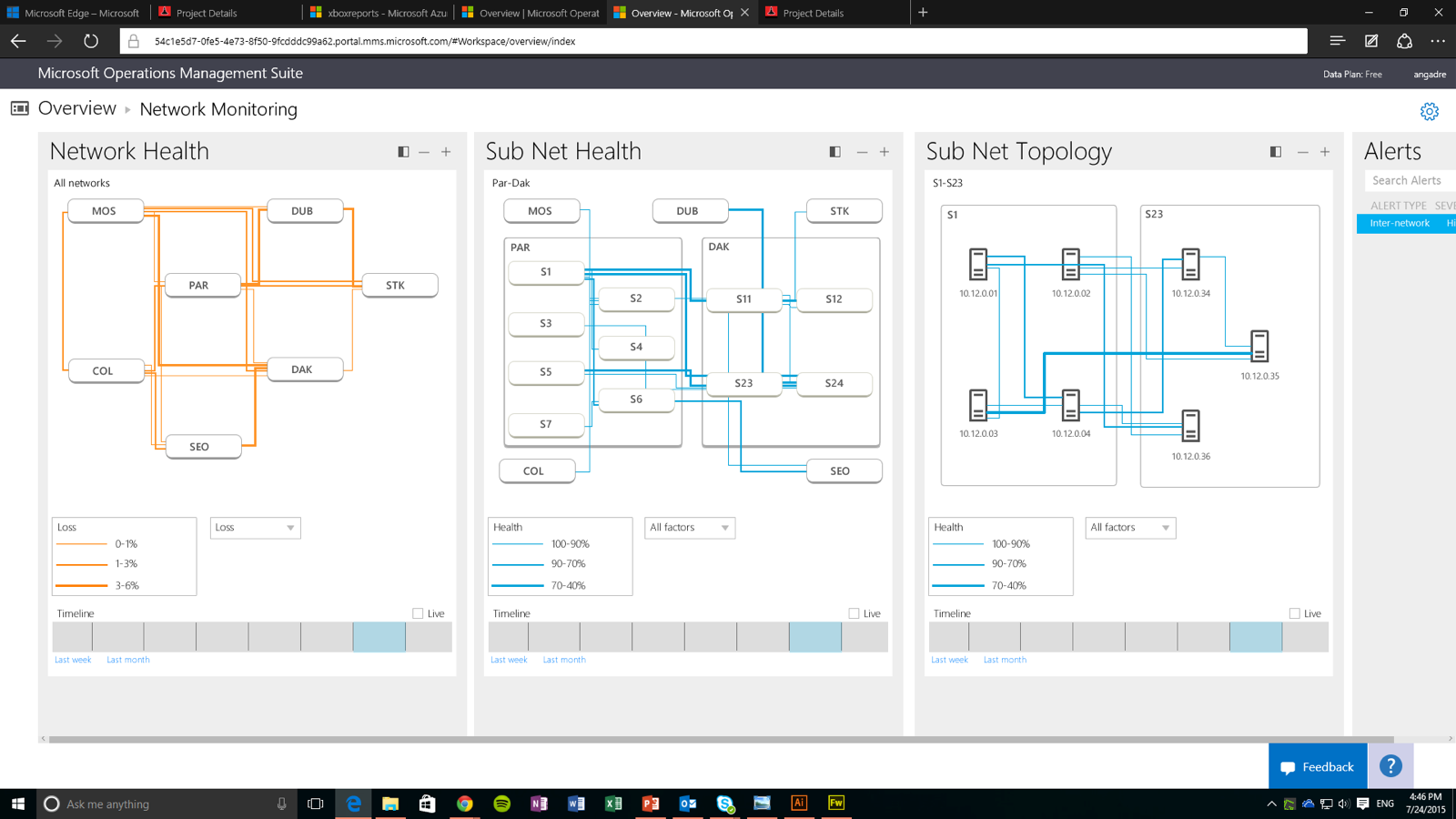


The final product was able to deliver the key functions that would be useful to end user, but also stay close to the OMS ecosystem and also share all it had to offer with the ecosystem.
The 3 user tasks
1. Ability to get a complete picture of network structure and health
2. Ability to localize the fault for further investigation
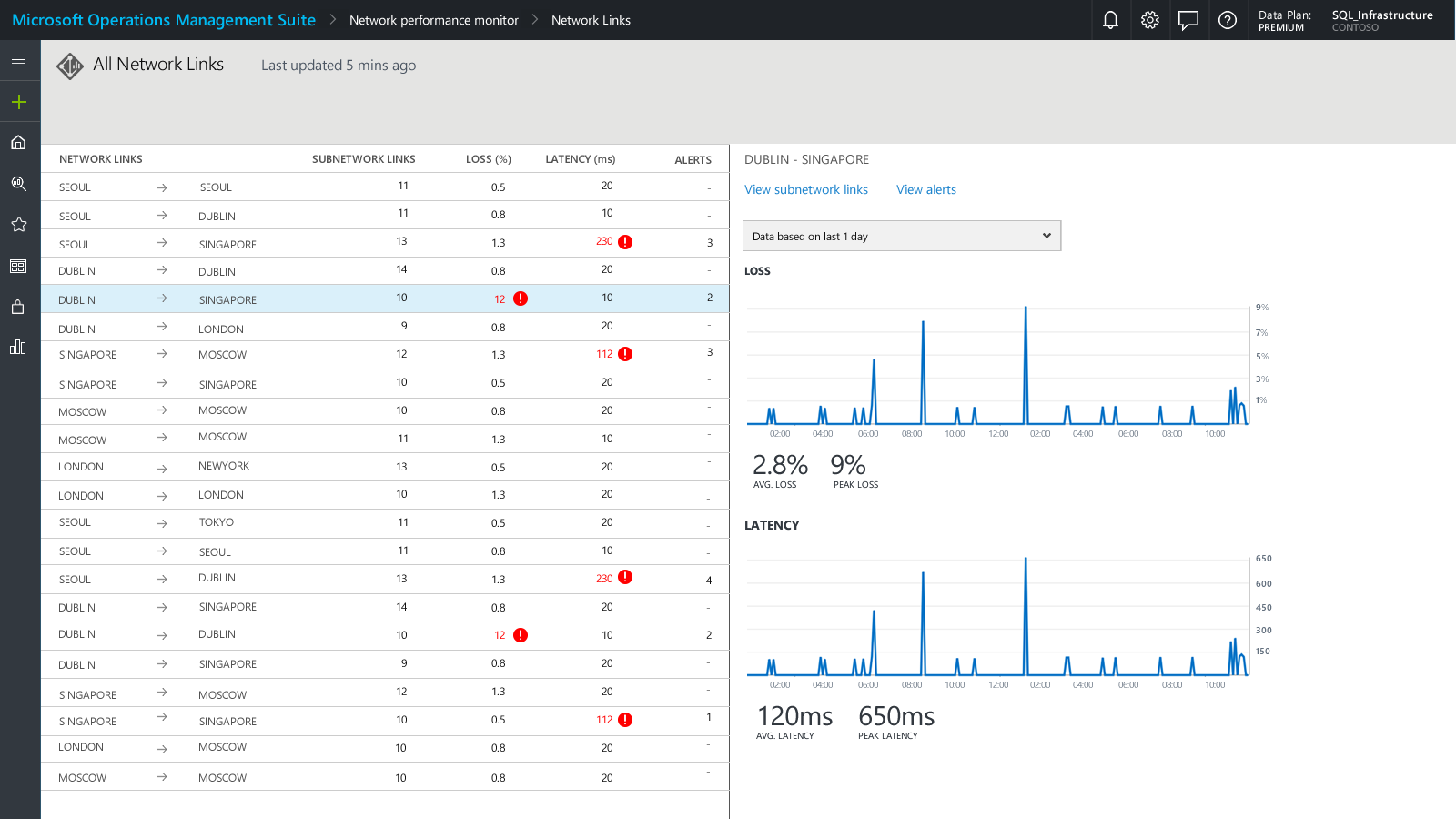


3. Ability to configure the network environment as an when changes occur.
Microsoft Cortana
Microsoft
Company
UX Designer
Role
2015
Year
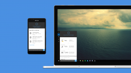
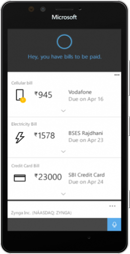
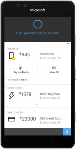
Cortana is Microsoft's personal digital assistant. When Cortana was to be launched in India, it was already an established product in other markets like the US. My role as a UX Designer was to identify market-specific scenarios and design POCs, which would make Cortana stand out in the India market at launch.
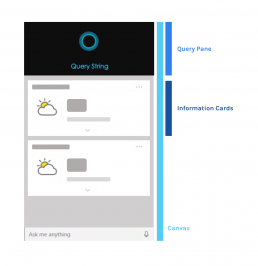
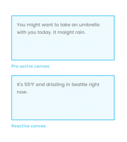
Apart from these challenges, I also had to understand and adopt the design framework on which information in Cortana was designed. The Cortana framework consisted of a canvas, which could be reactive or proactive, based on the scenario or user query. The information was conveyed using cards and the whole canvas was layered to display information when a user deep dives into a particular piece.
To identify the market scenarios, I was involved in brainstorms and idea session with the PM counterparts. With feedback from market research and 3rd party feasibility, we decided to go ahead with these two scenarios, Bill payments, and Trains.
Bill Payments
For context, in 2015 India was moving quickly into a digital era, and the way people managed bills and payments was changing drastically. Agencies for electricity, telecom, cellular, gas etc were using different mediums like emails and SMS to deliver bills to their subscribers. There was also a surge in virtual wallets that let users make payments to these bills. With so many options and mediums, there was an opportunity to deliver a centralized place to manage all bills and make payments.
The first step in designing the experience was identifying the critical and most important information that would be displayed on a card and the actions that a user would take based on the information and state.

After identifying this information, the next step was to design the scenarios and flows that would help users to manage their bills and payments.
Proactive scenarios
Tracking
Reminder
Reactive scenarios
Reminder
Payment
Trains
Indian Railways are an integral part of millions of Indians that use trains to travel for work or leisure. Indian Railways transports almost 25 million passengers daily. That’s nearly the total population of New Zealand, Australia and Tasmania put together. Trains are an experience in themselves. A train journey can last for a few minutes to a couple of days. Cortana had the potential to help users plan, manage and book their train journeys and get help while they are traveling.
Planning the journey
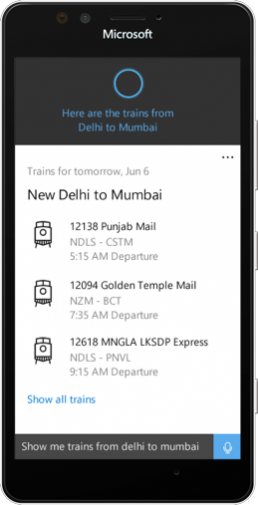
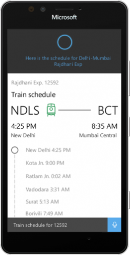
Before the journey
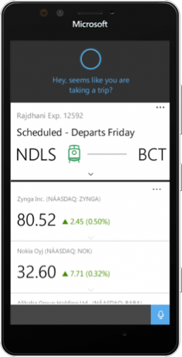
During the journey
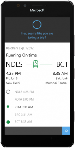
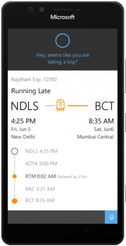
After I designed the first version of POC, it was tested with a set of users and I made some iterations based on the user feedback. One thing that stood out was the design of the train icon, which was perceived as bus or trams as it resembled European trains so I redesigned the icon to make it look familiar to Indian trains. Finally, The design was used as proof of concepts by the product and marketing teams to onboard partners and get feedback from users and leadership.